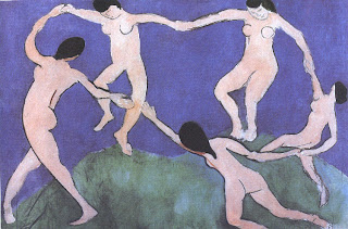
The documentary we watched was supposed to inspire us for our FMPs and end of year show plans, because Matisse's work is known to be very influential.. which after watching the hour long documentary I would agree with.

Matisse's work in 10 words: Simple, bold, intricate still life, colourful, Exploration of shape and colour, shocking, rule breaking, emotional, vibrant, distorted yet harmonious, visionary,
expressive, scruffy/messy and intense. Now I know that was more than 10 words, but his work was just so beautiful, 10 words just aren't enough. We saw the progression from fine art paintings to rough, expressive mark making experimental paintings, which was such an experience. I specially like the colours in Matisse's work, the colours made his work look so optimistic that it has its unique beauty, even if the shapes very illogical, the colours made sense on the canvases!


Matisse used various techniques in his work, ranging from impressionism to accurate still life in his early years as an artist. Later he used bold materials like charcoal to make rough expressive and crude marks on paper and walls! and then his last few years, his work became very abstract as he used paper cuttings for his work and in his last project - light. In the show, we saw that Matisse got his inspiration from his own passion of art the way he immersed himself in art as if his life depended on it, that's why he did what he did till his dying day! His other main inspiration for his bold striking colours was his experience in textile factories, all those bold colours flowing down like colourful waterfalls really changed the way Matisse looked at colours!
Many artists have been inspired by Matisse's work, from the bright colours to being able to put emotion in their work. Artist's like Rothko, Paul Smith (who makes clothing and accessories inspired by Matisse's work, whether that be snaps from his paintings, or his bold contrasting colours, and also fashion designers like Trisha Gill! But one of my favourite artist(or illustrator) who is inspired by Matisse's simplistic work with shape and colours is a guy called Dick Bruna, the creator of Miffy.

The simplistic shapes and colours are a clear indicator that Matisse had a great part in Bruna's work, and it's amazing to see a character who is so famously known by people to have been born through Matisse's magical talent of inspiring people with his work. Matisse's influence can be easily spotted today in commercial works, like the iPod adverts or the 2012 logo, as the same principal applies to them (Simplicity and bold colours).
Matisse's artwork was a response to all he went through in his life. You see that with the gradual evolution in his work from complexity to simplistic exploration in shapes and colours. It certainly was a moving piece of video, though I wouldn't have really liked to see the man sob on the screen... it was just so...fake *shrug*.

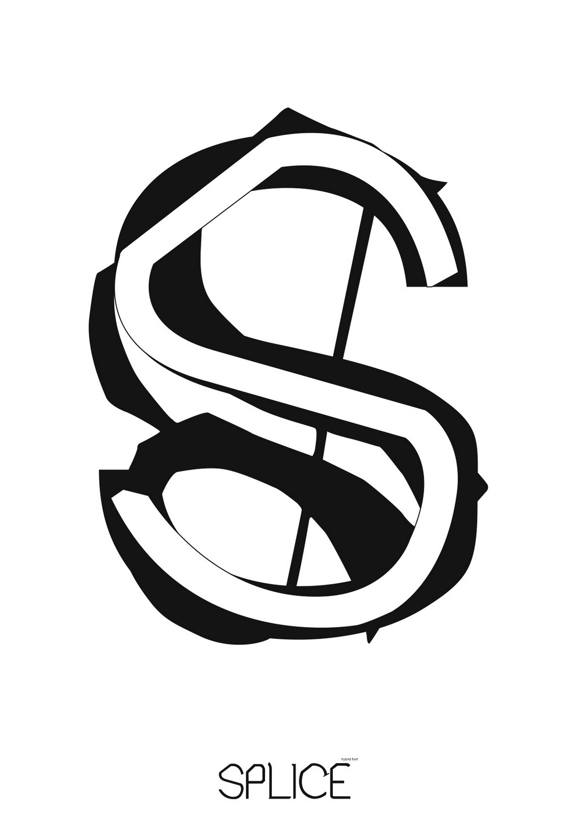
 hmmm, I wasn't intireally sure what I was doing with this. The whole idea of the poster was it to be black and white, just basic and to the point, but I guess the addition of colour makes it that tad bit more interesting and 'fun'.
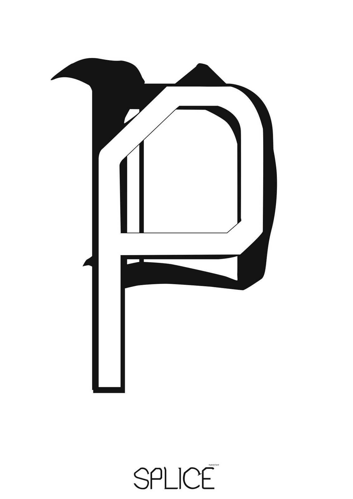
 hmmm, I wasn't intireally sure what I was doing with this. The whole idea of the poster was it to be black and white, just basic and to the point, but I guess the addition of colour makes it that tad bit more interesting and 'fun'.
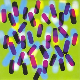