Monday 7 June 2010

Making the Sonogram ?!?


I thought I could maybe find a way to make a fake sonogram type looking image, and I searched and searched on the internet on how to achieve such results, but alas, no result. I guess it's just up to me to figure out a way to create this weird looking effect on CS4..somehow..

Also, I forgot to mension before, once the sonogram is finished, that will go towards the little handouts I will be making for people to pick up (as they will have a still from the sonogram as the background image and with a web link on there, where people could visit and download the font online), and also snaps from the animation will be blown up to make posters and those posters will be also submitted as better versions of the posters for the Splice.

End of year show? | Space


This is the space I have chosen to place my show, the corner of the feed studio! No special reason as to why, I just thought the sonogram will look good there, with the imac on a desk and the pregnant serif letter on there somewhere as well! I just wanna have as much as I can with this, as it's a really wonderful opportunity for me to show people and even myself of what I can do or am capable of I guess...

Sunday 6 June 2010

End of Year show | My Plans

Okay.. Now that the font is designed, it's time I get all the plans sorted for my end of year show! and the same question keeps popping up, HOW to show a hybrid font???? I could have some sort of a mural on the wall representing the stages of the hybrid, or I could have the posters printed and have a simple exhibition! But, looking at the exhibitions I researched, I want to do something more challenging and exciting, so that when people walk by my exhibit, there are atleast some heads nodding along with appreciation, as I want people to really enjoy my work.

After some really dry and dull moments of trying to come up with a solution for my show, and with some help from my group mate Alaa, the idea of sonograms emerged! Before, this is the time before I had even started making my font, I had wanted to make a poster for the hybrid font so that you could literally see the hybrid being conceived by the parent fonts. That idea certainly got some noses going up in disgust but to me it seemed like a cool concept. With the sonogram idea, it is more or less the same concept just more 'family friendly' I guess.

For those who don't know, a sonogram is a scanned image of a pregnant woman's unborn child in her tummy!

And the idea here is that instead of the unborn child, I want to place a hybrid letter in there, and I will make a little animation which hopefully replicates a sonogram imagery, with all the movements and other stuff!

When I pitched this idea to my tutor and some of my group mates, I got reactions that said 'hmmm. not sure if it's gonna work', but I'm still gonna charge on with this idea as it definitely seems the right thing to me..... and only time will tell how people will react to this!

With the sonogram animation, I will display that on a imac, and whether it needs to be hidden or not I still need to decide on that! Which will be set on a table along side the mum of the hybrid, the serif font letter, which will have wires going from it to the mac monitor (replicating a sonogram equipment).


At first I did want to try and make the sonogram equipment, but that is just too much and too unnecessary, all I want to show is the sonogram image and that bond between the mum and dad and the hybrid and to be honest, I don't think I will be hiding the imac screen, it won't effect the show in anyway plus it will just make things so much simpler for me...

I'm guessing all this writing is just making the idea seem like a mess, so I need to produce some visuals for the show, which I will get cracking at!

Tuesday 1 June 2010

Splice: Hybrid Font | Evaluation

The brief set for us stated that we must base our Final Major Project on the theme of DNA, but we could create anything we liked! That's what I loved about the project, the freedom but also the excitement of the subject (DNA), since it's something I am not familiar with but something that is a part of me, so this fmp was a fun way to learn more about the topic! Looking back at the whole project, I am VERY pleased with my outcomes, though it took a bit of time to get to where I am, it was all worth the effort.
Everything started from picking an area in DNA, and I picked genetics, the way traits are passed on from generation to generation, and what rare and common traits are between two parents and a child. I only picked this topic so that it would appeal to a wider audience and didn't want to explore my personal family as I saw most of my group mates were doing that. I decided to make a typeface because my interest/curiosity and love for typography. As I am still fairly new to the whole 'typography in graphic design', I was a bit nervous to choose the field, but I picked it in hope that after completing this FMP, I would be much more confident with my typography knowledge and would take that with me as a positive to University! And I'm happy to say that while completing this FMP, the skills and information I have took in have helped me so much!
My earlier research was just based on inspiration from other typographer and their style of work, but I was also trying to find maybe other graphic designers who had tried making hybrids of some sort and that's where I came across frank the grotesque blackletter, which became a strong inspirational work for me! Visits to galleries and museums were also recorded on the blog, and even though they didn't help me towards my typeface design, they helped me understand the basis of design, the principles of GOOD design.
The reason my typeface took a lot of time to create was because I had set myself to create the parental fonts as well, the blackletter and the san-serif, so that when fused together to create a offspring that will be totally original. My attention for the parental fonts was very much serious as I didn't want to rush them in anyway. Also, when starting to create my blackletter font, I had to go out and get some primary images to get myself familiar with the common shape of a blackletter typeface and for the san-serif, I took Helvetica as my main inspiration. Once the parental fonts were made, thats where the fun started for me, as I started splicing both the fonts together! I did this on paper and not on the Mac, as I wanted much more natural breeding, and the traits will be totally in my control without the obvious traits showing on the screen. Once the hybrid was made (which I was very delighted by), I started looking and got hold of a font editor that would make my font useable for everyone (as that was one of the deliverables I had listed in my proposal). I will keep working at making Splice, in a satisfactory condition for people to use, up until the end of year show!
And the posters in the end, I kept very simple and to the point! They narrate the fusion or Splicing should I say of both the parental typefaces to create something so..cool! Planning for the end of year show still continue, but as a last comment on the whole project, I enjoyed it A LOT! This was by far one of the best projects in the whole year and there is nothing I would want to change about it. Using the blogs was a very different yet fun experience. It is deffo an alternate for sketchbooks, as the annotation was much more easier, and it surely did save us some printer ink! but most importantly it was just so much easier as you can upload images and even videos in just a few clicks... If only we had got to use blogs for previous projects!

Final 6 Font Posters.


These are my final six posters, carrying on the same concept like explained in the previous post! They are all pretty successful and I like them a lot! They narrate the message of the font well and that's all I wanted from the posters.

Monday 31 May 2010

Font Poster Further Development??


The changes I made are as follows. I made the structure of the whole 3 different S's a bit smaller on the page and more central and I think it looks better, so definitely improvement from the previous posters!
hmmm, I wasn't intireally sure what I was doing with this. The whole idea of the poster was it to be black and white, just basic and to the point, but I guess the addition of colour makes it that tad bit more interesting and 'fun'.

Font Poster Development.


So these are my initial ideas for the final posters for the hybrid font! The posters are supposed to narrate the meaning of the font easily when people look at it, and by looking at this I think it's clear enough. The two parental fonts are spliced together on top of each other, and the hybrid is placed on top. Also, with the hybrid and the other fonts underneath, you can tell how the hybrid got it's 'traits' from!

Though, there was a problem with these couple of posters! The letters seem to placed in the middle but really big, so there is no sense of composition in there, which makes the posters less appealing graphically!

Poster development...


For my posters, I wanted to show a simple an straightforward concept in them! The two parental fonts combined to show the hybrid on top! I played around with the layers and adding and taking away strokes to see what different results I got and until I got something I was happy with.


I decided that there will be 6 posters, each one showing each letter of the word 'SPLICE'. All with the same concept.

Friday 28 May 2010

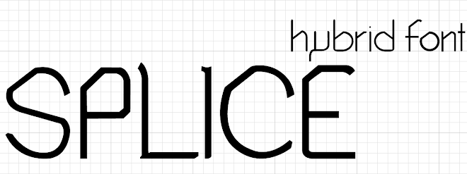
Splice: Hybrid font (Regular)


So, here it is, in its fame and glory! Splice Regular! Now using Fontlab studio 5, I can start generating the font to be downloadable for my end of year show!

Splice: Hybrid font (numbers and symbols)


and these are Splice's numbers and symbols!! phew, am I glad thats done with! Now I can start thinking about all the fun stuff like the posters and other deliverables, and FINALLY start thinking about my end of year show execution!

Splice: Hybrid font (A-Z lowercase)


Lowercase letters of Splice. Just as pleased with these as I am with the uppercase letters! just numbers punctuation and other symbols left!

Splice: Hybrid font (A-Z uppercase)


So here are the uppercase of Splice, I'm pleased with every letter. lowercase and symbols/numbers next.

Splice: Hybrid font (sketched A-Z, numbers and symbols)


This is my FINAL hybrid font! I love it! The sketches are looking great, just to digitize it to see how it comes out! Drawing the font like the san-serif on graph paper, gets all the letters in the same proportion and I have control over them.

Sunday 23 May 2010

Help to make my font real!

I found these great places that show how to make my font come to life from illustrator to the font editing software! Once I have completed all of my font I will definitely be using some help and tips from these sites!


1> Designing a Typeface on vector | tuts+


2> Cool Fonts on how do you create fonts?


3> Finally from Bittbox, How to: Make a Hand-Drawn Font?

Great sites with some really good help! The instructions are simple enough to understand and you can also have a bit of fun from the help that they do give!

Inspiration from other exhibitions?

I was interested to see how other designers have taken typographic approaches in their exhibitions and how they display their work. By doing this research, I'm hoping to get some idea for my plans for the show! the research is purely focused on typographic exhibitions, relating to my personal project.


The image above is from a beautiful typographic exhibition by Bruno Maag. The set up of the exhibition is pretty cool, with long streams of clear plastic cards hanging from the ceiling, swallowing the visitors in a typographic mist.


Picture ^ from Uk Communicate exhibition, Shanghai, China. The poster is covered with beautiful shapes and type. 'We will never pay attention to our daily objects, until you see this poster'

The picture above is from a science exhibition, but I wanted to include it here because of the beautiful display of light in there. The type on the wall 'light' is just amazing, as its being consistent with the lights hanging from the ceiling opposite, I think it works amazingly!


Above photos are from Terashima design exhibition. I love the type covered entrance! really gets your attention.


Design Cities/ Photo from Istanbul Museum of Modern Art. I like the type on the walls, I think it is cut out leaving a glow in the back. MAybe I could try something like that with my font? Having the mother or father letters cut out and projecting the hybrid from the back?


With my end of year show, as well as it being able to communicate my work well to the visitors, I want it to be fun and interactive, so people can come and just enjoy the work! I don't want to, in the end, resort to just huge posters displayed on the wall or just hanging there, I want to do something creative with my exhibit, so people will atleast remember it for a couple of hours or more after visiting the show!

I have Fontlab!!!


This is so exciting! I finally have a software which will help me to make my font come to life! Previously I was looking at TypeTool as an option! but since it was so basic that I couldn't even create a font family in there. TypeTool is like Paint and Fontlab studio is the Photoshop, so this is supercool that I got my hands on this bad boy! I can import all my letters from Splice as an .eps file from illustrator and import them into Fontlab, easy! All there is to do after I have done that is sorting out the technical bits like the kerning, tracking and having consistency in the font!

Deliverables for End of year show?


Now our choice is to either make a double page spread, like a leaflet to give away to people who come visit the show, or do something in an alternate format (which seems to be a better option, as you get to explore more and have fun), though the final has to be in black and white!

For the end of year I want to obviously make my font downloadable for people to go and use for free! So, I will be making a little leaflet which will have a link for people to go and visit to download the font. Also, I want to make an animation using my font, and the imagery on the leaflet will be snapshots from the animation itself. I still haven't thought about some bigger decisions like if I want massive posters around or a installation like a model or illustrated walls?

End of year show! END of year Show?? *end of year show*

Mmmmm. Our tutor, Simon, told us that it is time to start thinking about our end of year show, and how we are going to present our hard work to the public! And he also added that they want to decorate the feed studio inspired by Damien Hirst's Pharmacy installation, since our FMP theme is DNA, it's very appropriate and kinda cool really, it'll be like walking through a science exhibition.... just well designed! I have to choose a space in the FEED studio, where it will be most beneficial for my work to be displayed! The shelves are supposed to be looking like a scene from a pharmacy (like rows of medication lined up on them) or something like that... there's just so much space, it's kinda confusing.


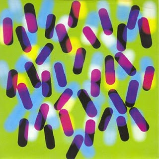
Above are snaps form Damien Hirst's Pharmacy installation. Below is work by Peter Saville for New order Fine Time. The Pills + the colour, create an interesting piece of work.


^ Packaging by Mark Farrow. This is interesting, as there could be something done with medicine packaging, by making our own customized labels to go on them, with information about our work?

Also, most of the people in my group have done so, so much more interesting stuff, that it would be great as an installation in the show. My work..... is a font. I'm not putting it down at all, just saying that I just need to do some planning and sketching and a lot of creative thinking for my work to be properly displayed in the show, that is if its going to be! What IS the best way to display a hybrid font??? drawing it? having lame 2d posters? or something else?


I really liked the cover, because of the customized periodic table. Maybe I could put letters of my font in a table like that? or it could be used as a means to insert all of groups work info in the table and displayed somewhere in the studio?

Moodboard! Moodboard! Moodboard!


I never realised that I hadn't posted my moodboard before!! this was one of the first things I did to get me started for this FMP! well here it is!

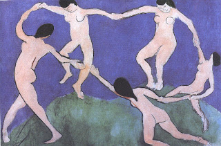
Documentary: Henry Matisse (Modern Masters)

The documentary we watched was supposed to inspire us for our FMPs and end of year show plans, because Matisse's work is known to be very influential.. which after watching the hour long documentary I would agree with.Add Image


Matisse's work in 10 words: Simple, bold, intricate still life, colourful, Exploration of shape and colour, shocking, rule breaking, emotional, vibrant, distorted yet harmonious, visionary,
expressive, scruffy/messy and intense. Now I know that was more than 10 words, but his work was just so beautiful, 10 words just aren't enough. We saw the progression from fine art paintings to rough, expressive mark making experimental paintings, which was such an experience. I specially like the colours in Matisse's work, the colours made his work look so optimistic that it has its unique beauty, even if the shapes very illogical, the colours made sense on the canvases!


Matisse used various techniques in his work, ranging from impressionism to accurate still life in his early years as an artist. Later he used bold materials like charcoal to make rough expressive and crude marks on paper and walls! and then his last few years, his work became very abstract as he used paper cuttings for his work and in his last project - light. In the show, we saw that Matisse got his inspiration from his own passion of art the way he immersed himself in art as if his life depended on it, that's why he did what he did till his dying day! His other main inspiration for his bold striking colours was his experience in textile factories, all those bold colours flowing down like colourful waterfalls really changed the way Matisse looked at colours!

Many artists have been inspired by Matisse's work, from the bright colours to being able to put emotion in their work. Artist's like Rothko, Paul Smith (who makes clothing and accessories inspired by Matisse's work, whether that be snaps from his paintings, or his bold contrasting colours, and also fashion designers like Trisha Gill! But one of my favourite artist(or illustrator) who is inspired by Matisse's simplistic work with shape and colours is a guy called Dick Bruna, the creator of Miffy.


The simplistic shapes and colours are a clear indicator that Matisse had a great part in Bruna's work, and it's amazing to see a character who is so famously known by people to have been born through Matisse's magical talent of inspiring people with his work. Matisse's influence can be easily spotted today in commercial works, like the iPod adverts or the 2012 logo, as the same principal applies to them (Simplicity and bold colours).

Matisse's artwork was a response to all he went through in his life. You see that with the gradual evolution in his work from complexity to simplistic exploration in shapes and colours. It certainly was a moving piece of video, though I wouldn't have really liked to see the man sob on the screen... it was just so...fake *shrug*.