Sunday 31 January 2010

Final 3D model!


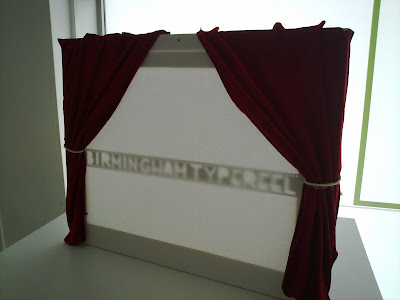
Our final finished piece, and we were all very pleased with the outcome! We weren't sure if the light would pass through nicely from the back, to be honest we didn't have much time to make it so it was either a win or a fail, fortunately though, the stencil worked perfectly and the torches we used made the whole thing look all dramatic and fantastic!

There were tiny details that we wanted to add to the final finished piece but couldn't because of time restraint, like instead of already drawn curtains, it would have been made so that the curtains would be closed so we would have to pull them. Also, it would have been cool for the lights to move about a bit, giving the whole cinema model 'movement' and feel. We had also discussed some 'epic' music playing in the background while presenting the mini cinema, but that never came to happen!

Overall though, we are very happy with the whole process of making this typographic model, it was a challenging yet fun week for us all!
Friday 15 January 2010

Further Development...


We originally wanted the font on top of the canvas coming out in 3D to make an effect akin to the I heart NY picture, we originally planned to make the letter forms by folding the film in shapes, we were going to use actual 16MM film to do this, however because of lack of time in the project, we were unable to get any authentic film and instead we decided to use camera film.

Later though, we thought that sticking the reel on top of the canvas would not be such a good idea, and not so creative so we came to conclusion of projecting stenciled letters from the film reel onto the canvas, which everyone was pleased about! We wanted to project the light on top of the canvas, but the lights would obstruct the way for the audience to see the projected letters, so projecting the light from behind was the best solution!

Two simple Torches on two drum stands things with a bit of cello tape for holding the torches is all it took to make our spot lights! Cheap and simple and VERY effective! If you need any technical work like that done, then go to Saif Zahra!, he's the guy who made the lights..genius!

Making Process...

This is the mini copy of a cinema screen, where the typography will be placed upon. The curtains were added to give it that authentic traditional cinema feel.

Recreating type...


This is our initial attempt at replicating the art deco style. The type was recreated using the Electric cinema as reference, but some letters I had to improvise with and create entirely from scratch, like the 'B' and 'G' for example, but it worked out okay.

Initial thoughts

We decided to work with the Electric Cinema because it's unique to Birmingham by being the oldest cinema in Britain, found in 1909. We wanted to choose a piece that wasn't as well known like for example; the bullring or Aston Villa and originally thought about working with Birmingham's reputation of being the birth place of heavy metal with artists such as; Ozzy Osbourne + Black Sabbath along with Judas Priest etc all coming from the city however we opted for the cinema because we liked it's heritage, how it's stood the test of time and how it's down a side street unlike the Odeon on New St. which we felt adds to its character and charm.
The Electric Cinema sprung to mind when we talked about Birmingham's typography because it's art deco style is unusual to see these days however it was a common theme with cinema's back in the day so it was important we kept that style within our typography which I feel has been executed successfully.

Thursday 14 January 2010

Getting experimental...


After getting hold of some photo reel, its time to think about how exactly are the letters going to form on the paper?

I started experimenting with different ways the reel could be cut up in ways and glued to the page. I wanted to keep that reel border, as that just adds to the whole look.

First it was just simply cutting the reel into strips and positioning them together to make the letter, but that isn't so creative so then I tried adding a fold to the reel with the extra reel to improve the letter, and I was rather please with this way of creating the letters.

But there was no interesting typeface coming out that way, we still wanted to recreate the letters inspired from the electric cinema type, so I resulted to making the reel into a stencil. The font cut out is based from the electric cinema. From the three experiments, we decided the stenciled letter was the closest to what we wanted the overall letters to look like, now its just the matter how deciding how we are to use the stencil, or further experimentation is needed?!


So for our final letters, we are going to be using photo reel, and as the whole theme behind it is Birmingham's history with the electric cinema, we thought about how we can make the final model interesting by adding elements to or around the letters that showcase that theme too. Ideas such as, making an actual mini cinema screen to display the letters, a stage and appropriate lighting, to give the whole model an old cinema feel to it. Just as a thought, if there is going to be a back drop, maybe it could be like a crackly screen u saw in the old black and white movies, to make it look all dated.


Phrase that is synonymous with or unique to Birmingham...

The phrase we have decided to create with the letters is 'B'ham Type reel'. Originally it was 'B'ham Typography Showreel', but we thought it was too long to be made out of the reel, so we shortened it. The idea behind the phrase was the thought of showcasing Birmingham's typography history, and thats simply it.

We also came across a problem. Turns out getting hold of a film reel will be difficult before the 3-D letters have to be produced, so instead, we have decided to make the letters out of photo reel. It is practically the same stuff, so it doesn't effect our ideas much.

Wednesday 13 January 2010

The Electric Cinema

We have decided to base our 3-D lettering from the electric cinema. The electric cinema has a strong history with Birmingham, so there is definitely that traditional feel to the subject, and being Birmingham's oldest cinema, it is also something very unique. We have also decided that the material being used to make the lettering is film reel, as it links with the whole cinema thing, so we wont be recreating the typeface on the electric cinema sign, but it would be nice to see something similar to that effect as it has that good old look. So far, the idea is to just stick the film reel on the paper as a san serif font, or to have it flow continuously from the metal case the film reel is in and make it into a beautiful piece of typography.

Tuesday 12 January 2010

Type Journey


This is a collection of pictures of typography around Birmingham city centre. It really shows the diversity in type we have around us and so casually seem to walk past it everyday without giving it much thought. Walking around Birmingham and actually switching your eyes to typography that you normally wont look at twice, it really opens up your knowledge of how type is found in different places, serving different kinds of purposes and conveying different messages. One of the examples of noticing new things about typography in Birmingham is how I never really payed much attention to 'ghost typography', where the letters were almost invisible against the surface, deteriorated by the weather and age, but you can still manage to see what was there before, like a print left behind, which I think is quite amazing.


This little graffitied work got my attention straight away, and for some reason I just thought it was really cool typography. The hand writing gives the type an energetic and expressive look, which you can never capture in digitally produced typography work.

It is really awesome to see such a great part of Birmingham still surviving surrounded by all this re-generation, and making Birmingham into this up-to-date place, which is not a bad thing, just nice to see that something survived through all this.


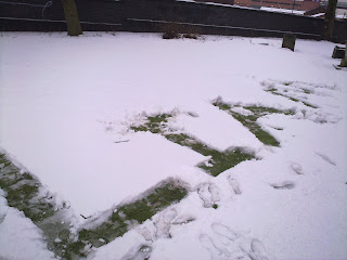
Typography in the snow...


haha, a bit of super-sized snow ball fun!

Gatso Typeface


This is a typeface inspired by speed cameras. It is not completely illegible, though it is set to be an abstract font. The reason behind the illegibility was to make it all cryptic, just how speed cameras are all hidden (well some are) from the motorists on the road. You can still spot the letters in there, you just have to look closely.

This is the smaller case for the font that I didn't use because I don't think it looked consistent enough with the uppercase letters, but i still think it looked rather cool, very 'future looking' in a way.
This is the smaller case I went for at the end, using negative space as to create them. It also makes them consistent looking with the uppercase so they were better suited than the circular shaped lowercase letters.

This is my type poster for the typeface. The theme was road safety. I based it around this image I found on the net, of this burned out speed camera which I thought looked very different and quite amazing so I wanted to recreate that burned look with my type. I am very pleased with the final results here, 'cause I think you do get a sense of narrative behind the font.

Gatso!

Monday 11 January 2010

Typography Poster


from http://www.behance.net/Gallery/NY/325916

pretty amazing stuff on behance.net

new to blogs

New post in new blog, pretty exciting stuff.