
Showing posts with label Typography. Show all posts
Showing posts with label Typography. Show all posts
Thursday, 1 April 2010

Sunday, 21 March 2010
Am I Collective...
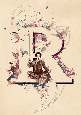
Am I Collective is a brilliant studio based in Cape town, South Africa and they are multi-talented group, specializing in typography, illustration, 3D and much more. But I have fallen in love with their beautiful lettering, and the intricate detail that goes into them.



Typography Artists | Inspiration
These are a few typography artists with some amazing designs, each of their styles are different and definitely inspiring
Nicolas A. Girard | http://goodmorningstranger.com/

Islam Zayed | http://www.behance.net/DZL86


Theo Aartsma | http://www.sumeco.net/


Daniel Gordon | http://www.behance.net/DanGordon


Monday, 8 February 2010
A-Z around Birmingham...

Sunday, 31 January 2010
Final 3D model!


Our final finished piece, and we were all very pleased with the outcome! We weren't sure if the light would pass through nicely from the back, to be honest we didn't have much time to make it so it was either a win or a fail, fortunately though, the stencil worked perfectly and the torches we used made the whole thing look all dramatic and fantastic!
There were tiny details that we wanted to add to the final finished piece but couldn't because of time restraint, like instead of already drawn curtains, it would have been made so that the curtains would be closed so we would have to pull them. Also, it would have been cool for the lights to move about a bit, giving the whole cinema model 'movement' and feel. We had also discussed some 'epic' music playing in the background while presenting the mini cinema, but that never came to happen!
Overall though, we are very happy with the whole process of making this typographic model, it was a challenging yet fun week for us all!
Friday, 15 January 2010
Initial thoughts
We decided to work with the Electric Cinema because it's unique to Birmingham by being the oldest cinema in Britain, found in 1909. We wanted to choose a piece that wasn't as well known like for example; the bullring or Aston Villa and originally thought about working with Birmingham's reputation of being the birth place of heavy metal with artists such as; Ozzy Osbourne + Black Sabbath along with Judas Priest etc all coming from the city however we opted for the cinema because we liked it's heritage, how it's stood the test of time and how it's down a side street unlike the Odeon on New St. which we felt adds to its character and charm.
The Electric Cinema sprung to mind when we talked about Birmingham's typography because it's art deco style is unusual to see these days however it was a common theme with cinema's back in the day so it was important we kept that style within our typography which I feel has been executed successfully.
The Electric Cinema sprung to mind when we talked about Birmingham's typography because it's art deco style is unusual to see these days however it was a common theme with cinema's back in the day so it was important we kept that style within our typography which I feel has been executed successfully.
Tuesday, 12 January 2010
Type Journey
This is a collection of pictures of typography around Birmingham city centre. It really shows the diversity in type we have around us and so casually seem to walk past it everyday without giving it much thought. Walking around Birmingham and actually switching your eyes to typography that you normally wont look at twice, it really opens up your knowledge of how type is found in different places, serving different kinds of purposes and conveying different messages. One of the examples of noticing new things about typography in Birmingham is how I never really payed much attention to 'ghost typography', where the letters were almost invisible against the surface, deteriorated by the weather and age, but you can still manage to see what was there before, like a print left behind, which I think is quite amazing.


This little graffitied work got my attention straight away, and for some reason I just thought it was really cool typography. The hand writing gives the type an energetic and expressive look, which you can never capture in digitally produced typography work.

It is really awesome to see such a great part of Birmingham still surviving surrounded by all this re-generation, and making Birmingham into this up-to-date place, which is not a bad thing, just nice to see that something survived through all this.

Typography in the snow...

haha, a bit of super-sized snow ball fun!
Gatso Typeface

This is a typeface inspired by speed cameras. It is not completely illegible, though it is set to be an abstract font. The reason behind the illegibility was to make it all cryptic, just how speed cameras are all hidden (well some are) from the motorists on the road. You can still spot the letters in there, you just have to look closely.

This is the smaller case for the font that I didn't use because I don't think it looked consistent enough with the uppercase letters, but i still think it looked rather cool, very 'future looking' in a way.

This is the smaller case I went for at the end, using negative space as to create them. It also makes them consistent looking with the uppercase so they were better suited than the circular shaped lowercase letters.

This is my type poster for the typeface. The theme was road safety. I based it around this image I found on the net, of this burned out speed camera which I thought looked very different and quite amazing so I wanted to recreate that burned look with my type. I am very pleased with the final results here, 'cause I think you do get a sense of narrative behind the font.
Gatso!
Subscribe to:
Posts (Atom)