Showing posts with label Splice. Show all posts

Monday, 7 June 2010

Making the Sonogram ?!?


I thought I could maybe find a way to make a fake sonogram type looking image, and I searched and searched on the internet on how to achieve such results, but alas, no result. I guess it's just up to me to figure out a way to create this weird looking effect on CS4..somehow..

Also, I forgot to mension before, once the sonogram is finished, that will go towards the little handouts I will be making for people to pick up (as they will have a still from the sonogram as the background image and with a web link on there, where people could visit and download the font online), and also snaps from the animation will be blown up to make posters and those posters will be also submitted as better versions of the posters for the Splice.

Tuesday, 1 June 2010

Final 6 Font Posters.


These are my final six posters, carrying on the same concept like explained in the previous post! They are all pretty successful and I like them a lot! They narrate the message of the font well and that's all I wanted from the posters.

Monday, 31 May 2010

Font Poster Further Development??


The changes I made are as follows. I made the structure of the whole 3 different S's a bit smaller on the page and more central and I think it looks better, so definitely improvement from the previous posters!
hmmm, I wasn't intireally sure what I was doing with this. The whole idea of the poster was it to be black and white, just basic and to the point, but I guess the addition of colour makes it that tad bit more interesting and 'fun'.

Font Poster Development.


So these are my initial ideas for the final posters for the hybrid font! The posters are supposed to narrate the meaning of the font easily when people look at it, and by looking at this I think it's clear enough. The two parental fonts are spliced together on top of each other, and the hybrid is placed on top. Also, with the hybrid and the other fonts underneath, you can tell how the hybrid got it's 'traits' from!

Though, there was a problem with these couple of posters! The letters seem to placed in the middle but really big, so there is no sense of composition in there, which makes the posters less appealing graphically!

Poster development...


For my posters, I wanted to show a simple an straightforward concept in them! The two parental fonts combined to show the hybrid on top! I played around with the layers and adding and taking away strokes to see what different results I got and until I got something I was happy with.


I decided that there will be 6 posters, each one showing each letter of the word 'SPLICE'. All with the same concept.

Friday, 28 May 2010

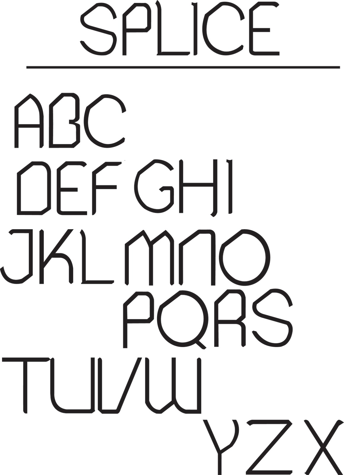
Splice: Hybrid font (Regular)


So, here it is, in its fame and glory! Splice Regular! Now using Fontlab studio 5, I can start generating the font to be downloadable for my end of year show!

Splice: Hybrid font (numbers and symbols)


and these are Splice's numbers and symbols!! phew, am I glad thats done with! Now I can start thinking about all the fun stuff like the posters and other deliverables, and FINALLY start thinking about my end of year show execution!

Splice: Hybrid font (A-Z lowercase)


Lowercase letters of Splice. Just as pleased with these as I am with the uppercase letters! just numbers punctuation and other symbols left!

Splice: Hybrid font (A-Z uppercase)


So here are the uppercase of Splice, I'm pleased with every letter. lowercase and symbols/numbers next.

Splice: Hybrid font (sketched A-Z, numbers and symbols)


This is my FINAL hybrid font! I love it! The sketches are looking great, just to digitize it to see how it comes out! Drawing the font like the san-serif on graph paper, gets all the letters in the same proportion and I have control over them.