Showing posts with label Hybrid Font. Show all posts

Tuesday, 1 June 2010

Final 6 Font Posters.


These are my final six posters, carrying on the same concept like explained in the previous post! They are all pretty successful and I like them a lot! They narrate the message of the font well and that's all I wanted from the posters.

Monday, 31 May 2010

Font Poster Further Development??


The changes I made are as follows. I made the structure of the whole 3 different S's a bit smaller on the page and more central and I think it looks better, so definitely improvement from the previous posters!
hmmm, I wasn't intireally sure what I was doing with this. The whole idea of the poster was it to be black and white, just basic and to the point, but I guess the addition of colour makes it that tad bit more interesting and 'fun'.

Poster development...


For my posters, I wanted to show a simple an straightforward concept in them! The two parental fonts combined to show the hybrid on top! I played around with the layers and adding and taking away strokes to see what different results I got and until I got something I was happy with.


I decided that there will be 6 posters, each one showing each letter of the word 'SPLICE'. All with the same concept.

Friday, 28 May 2010

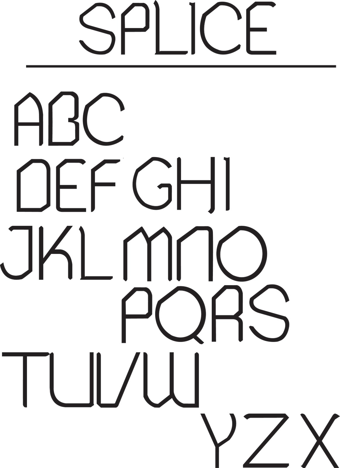
Splice: Hybrid font (Regular)


So, here it is, in its fame and glory! Splice Regular! Now using Fontlab studio 5, I can start generating the font to be downloadable for my end of year show!

Splice: Hybrid font (numbers and symbols)


and these are Splice's numbers and symbols!! phew, am I glad thats done with! Now I can start thinking about all the fun stuff like the posters and other deliverables, and FINALLY start thinking about my end of year show execution!

Splice: Hybrid font (A-Z lowercase)


Lowercase letters of Splice. Just as pleased with these as I am with the uppercase letters! just numbers punctuation and other symbols left!

Splice: Hybrid font (A-Z uppercase)


So here are the uppercase of Splice, I'm pleased with every letter. lowercase and symbols/numbers next.

Splice: Hybrid font (sketched A-Z, numbers and symbols)


This is my FINAL hybrid font! I love it! The sketches are looking great, just to digitize it to see how it comes out! Drawing the font like the san-serif on graph paper, gets all the letters in the same proportion and I have control over them.

Sunday, 23 May 2010

Help to make my font real!

I found these great places that show how to make my font come to life from illustrator to the font editing software! Once I have completed all of my font I will definitely be using some help and tips from these sites!


1> Designing a Typeface on vector | tuts+


2> Cool Fonts on how do you create fonts?


3> Finally from Bittbox, How to: Make a Hand-Drawn Font?

Great sites with some really good help! The instructions are simple enough to understand and you can also have a bit of fun from the help that they do give!

I have Fontlab!!!


This is so exciting! I finally have a software which will help me to make my font come to life! Previously I was looking at TypeTool as an option! but since it was so basic that I couldn't even create a font family in there. TypeTool is like Paint and Fontlab studio is the Photoshop, so this is supercool that I got my hands on this bad boy! I can import all my letters from Splice as an .eps file from illustrator and import them into Fontlab, easy! All there is to do after I have done that is sorting out the technical bits like the kerning, tracking and having consistency in the font!

Friday, 21 May 2010

Possible name for my hybrid font???


I was on apple.com/trailer the other day and I saw this upcoming 'horror' flick and the name caught my attention! The movie is about this couple who make a hybrid using human DNA, very similar to my FMP. The word splice means to join two or more things together and thats exactly what I'm doing with my hybrid font! This will be a cool font name!

San_Serif Font: Numbers


Hmmm, I'm not keen on the numbers now as I look at them, I much prefer the sketched versions of these than the digital version! but this post finished my dad font! now I can start mixing the two font to make the hybrid! This should be lots of fun!!

San_Serif Font: Punctuation/Symbols


These are all the, if not most of the punctuation and symbols from the dad font! My fav from all the characters is the percentage mark, looks pretty interesting!

San_Serif Font: A-Z lowercase


Another tick in the box. Lowercase of dad font done and dusted. All thats left now is mac'in up the punctuation/symbols and the numbers to finish this font!

I know that the blackletter and san-serif font aren't presented the best possible way! but these posts are just to show how the fonts are getting along!

San_Serif Font: A-Z Uppercase


Uppercase of dad font digitized and it looks pretty good actually, no complaints yet! hope everything else goes as smoothly as this!

San_Serif Font: Final Sketches


And this is the other half of the puzzle that will make my hybrid come to life, my dad font! I did the sketches on graph paper this time unlike the blackletter font (which I should have done) since I got a much better scale and lines for the edges and it helped a LOT! just to digitize this as well! (though, I kinda do like them just sketched, the pencil lines are pretty strong by themselves)


The font includes, like the blackletter, Complete A-Z in both upper and lower case, also with punctuation/symbols and numbers!

Blackletter font: Symbols + Numbers


Yes, yes I know if you look up close the font is not perfect, but if I literally sit here and try to perfect all three fonts (the mom font, the dad font and then the final hybrid font), I will be here till Feb. 2011. I just needed these quick yet satisfactory mom and dad fonts to give me a nice and crisp Hybrid font.

This is the last of my blackletter font! next up is my San-serif font (dad font)

Blackletter font: Lowercase


Digitized the smaller case of my blackletter font, it's a long and tedious task since my mom and dad font aren't going to be downloaded in the end and I can just present them as sketches, but I wanted to do this, to get the hybrid right the first time! and it's coming along slowly but surely!

Sunday, 16 May 2010

Blackletter font: Uppercase (digital)


Slowly but surely I'm refining all the sketched letters on Illustrator, and it's finally becoming fun again! but lots more to do!

Saturday, 15 May 2010

Fontstruct: great fun or just no helpful at all? :(


Ok, since I had decided to take a break from fontstruct since it was being a pain in the neck, I went back to it the other day to give it another go!

So... the catch behind the whole free service from the providers is that you make your font out of pixels, which doesn't seem much of a problem when you think about it, since everything (digitally) is made out of tiny pixels. BUT! looking at all the curves I have to create with the hybrid, I want a VERY VERY smooth looking font, so for me to be able to achieve that, I literally have to use A LOT of pixels to make that smooth looking font. And of course, this is my FMP, so I want this hybrid font near enough perfection. Now, I'm not accepting defeat with fontstruct, but sometimes, while using it, it just makes me want to through my laptop across the room and just forget about it all....

oh well, be positive, think positive... so everything should be positive right?